The Copilot Report Your CFO Actually Wants
Finance wants one page: spend, value, what's recoverable. See how a proper Copilot ROI report replaces screenshots and guesswork with board-ready numbers.


Finance doesn’t want a usage dashboard. They want one page that answers what we’re spending, what we’re getting, and what we can recover.
Why Most Copilot Reporting Never Makes It to the Board
Finance doesn’t want a usage dashboard. They want one page that answers three questions clearly: what are we spending, what are we getting for it, and what can we recover? Most Copilot analytics tools can’t actually produce that page. What they generate instead is a usage dashboard full of activity graphs and adoption percentages, useful for IT, largely meaningless in a finance conversation.
That gap is exactly where renewal conversations stall. Someone pulls together screenshots of a usage dashboard, tries to translate adoption percentages into a spend justification on the fly, and the conversation ends in “let’s revisit this next quarter” instead of a decision. Not because the value isn’t there, but because nobody could show it in the format finance actually needed.
The Three Reports a Copilot ROI Conversation Actually Requires
A genuine Copilot ROI report needs to speak three different languages to three different audiences, from the same underlying data.
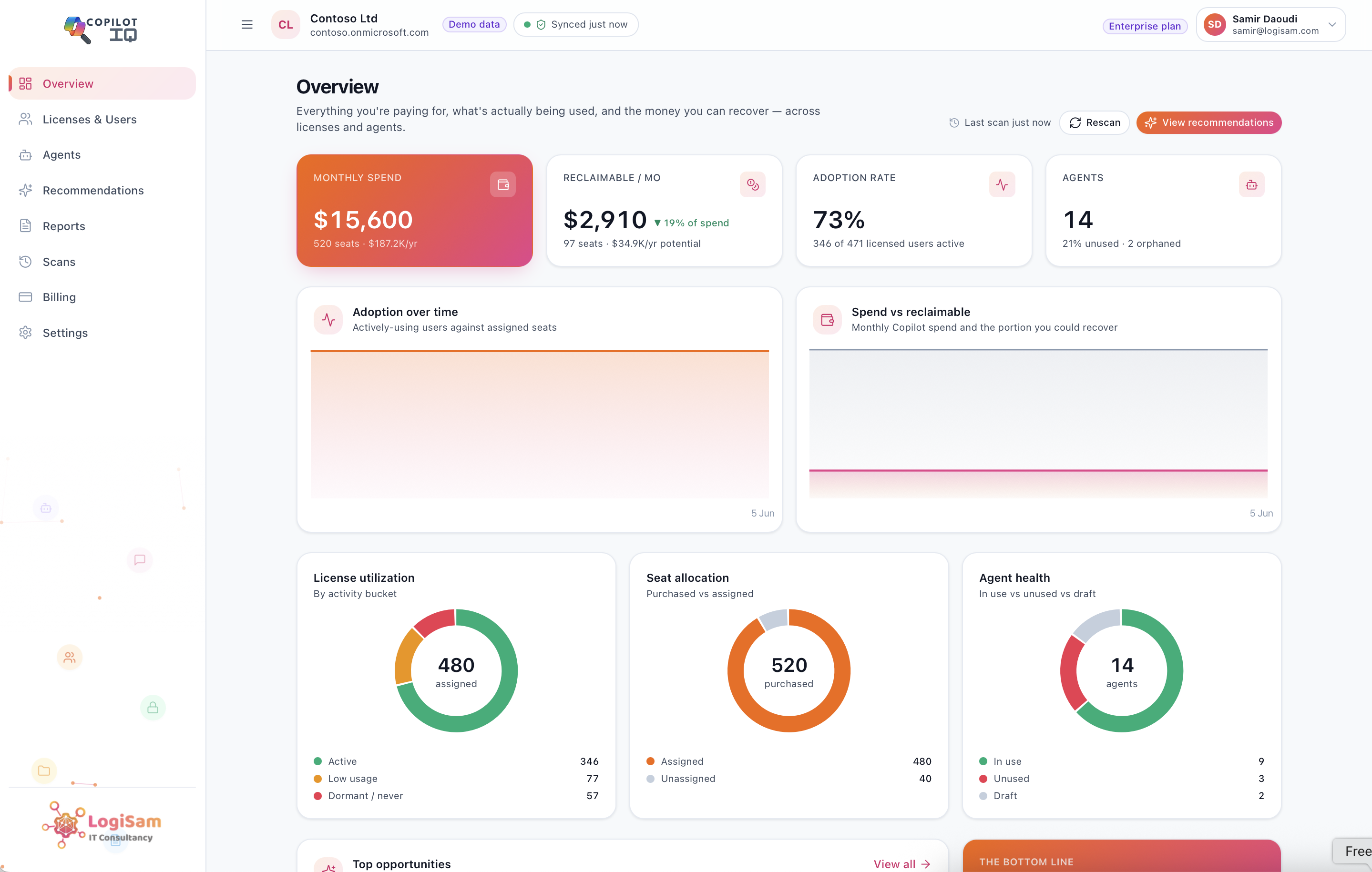
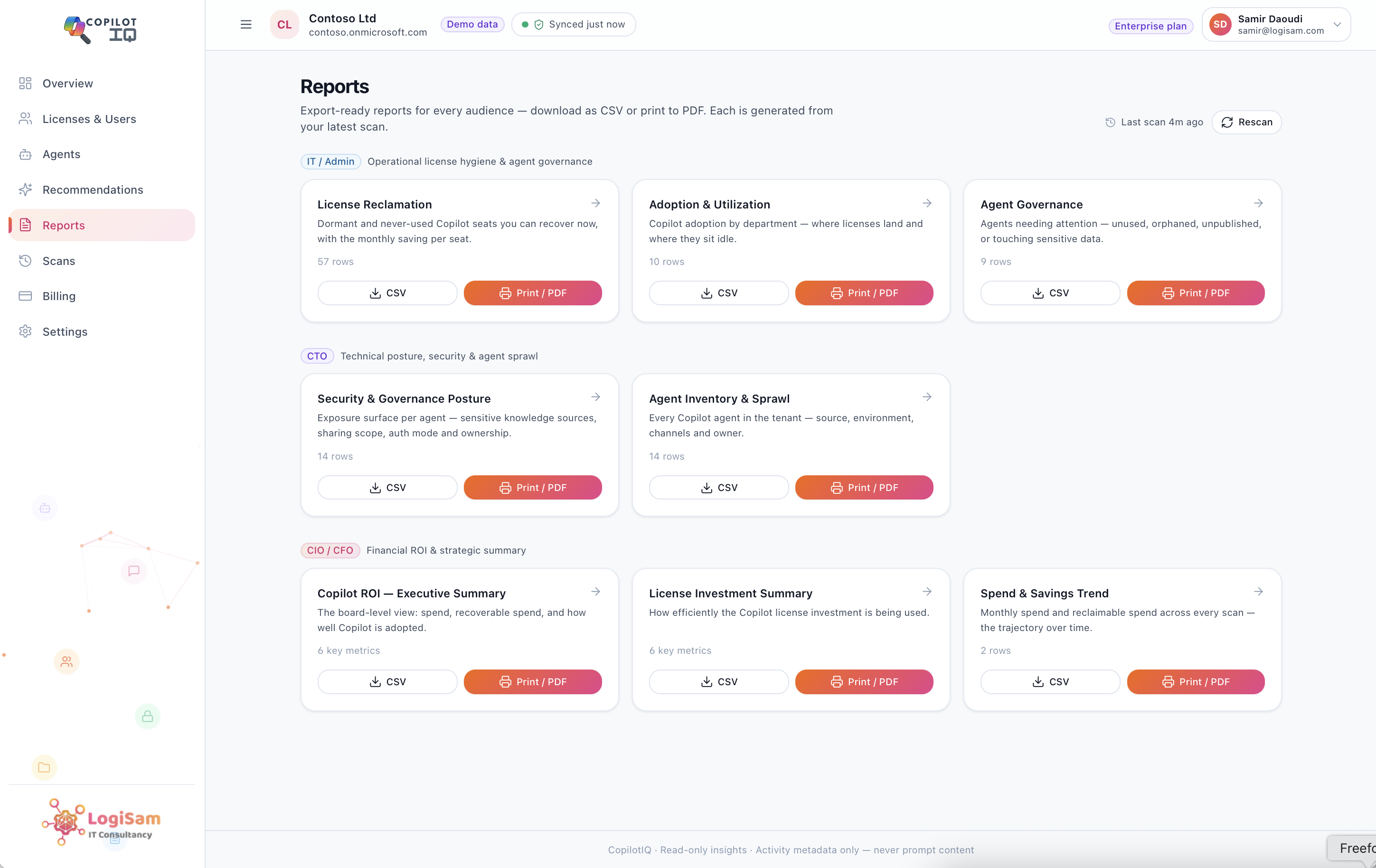
For the CIO or CFO, the report that matters is an executive ROI summary: monthly and annual Copilot spend, reclaimable spend broken out clearly, adoption rate as a real percentage of active use rather than assigned licences, and cost per active user as a single defensible figure. This is the one-page version, the one that goes into a board pack without needing translation.
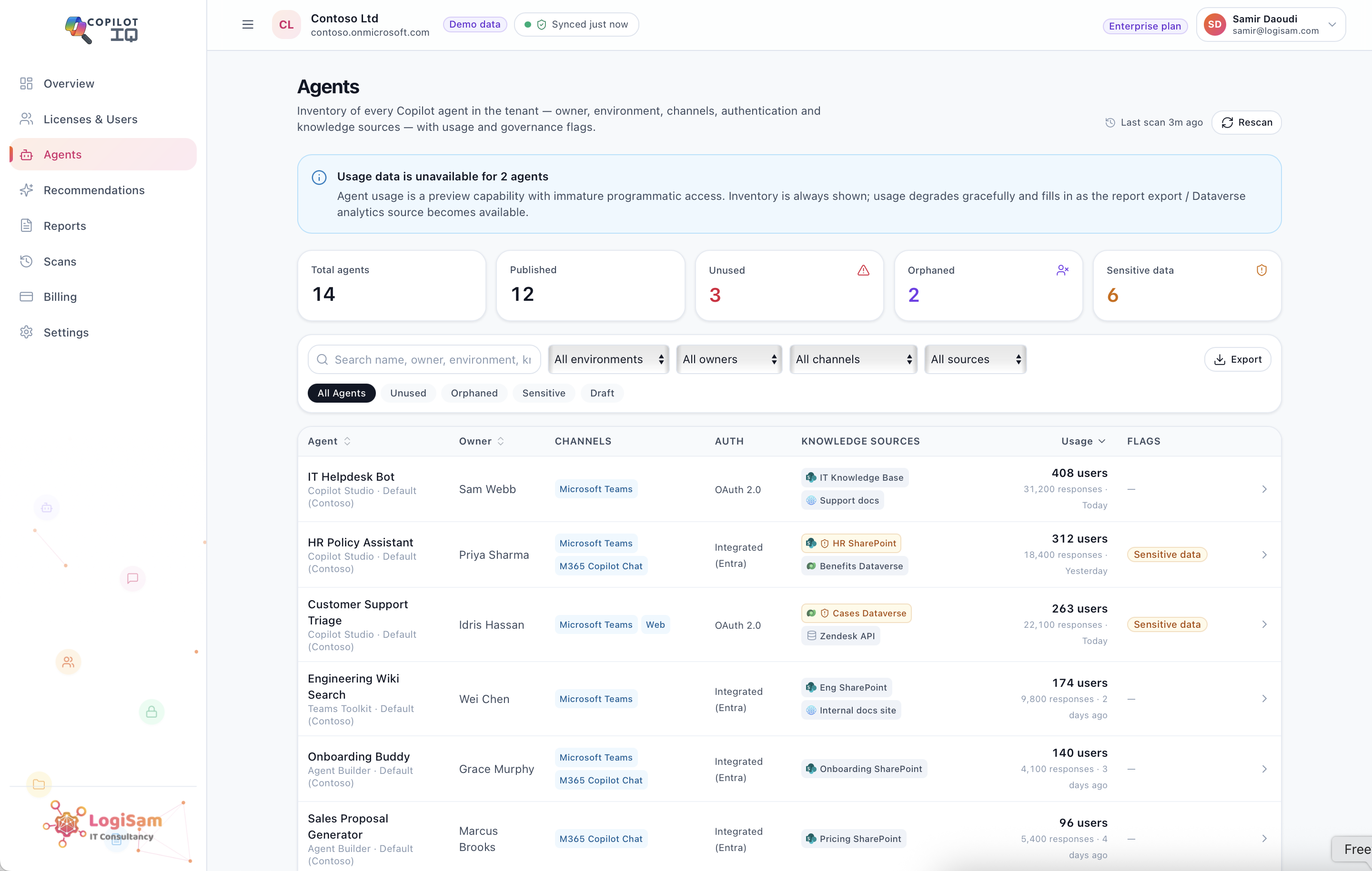
For the CTO, the relevant report shifts to security and agent-sprawl posture: which sensitive data sources Copilot agents touch, how broadly content is being shared, what authentication methods are in use, and which agents have gone orphaned with nobody responsible for them anymore.
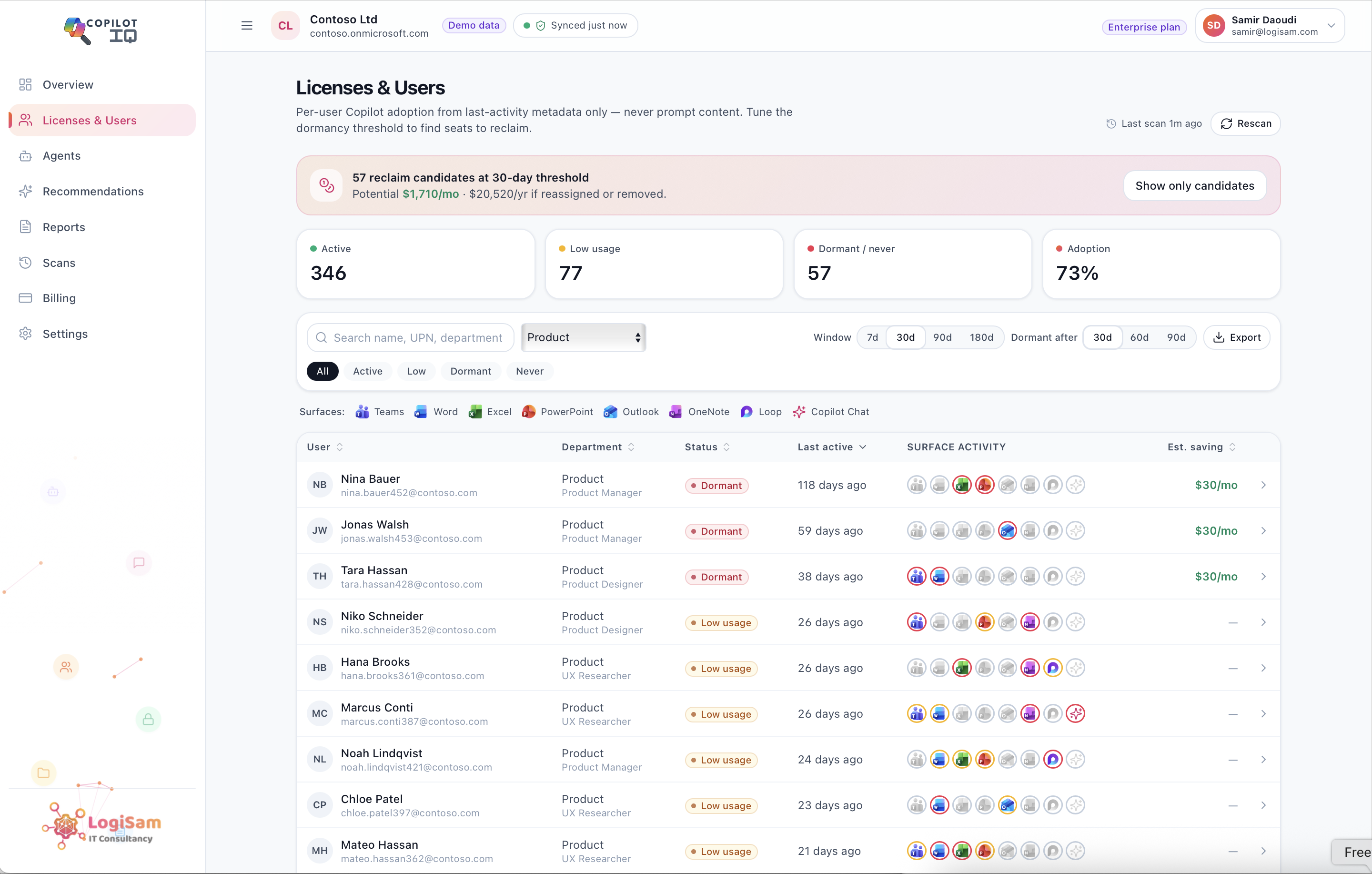
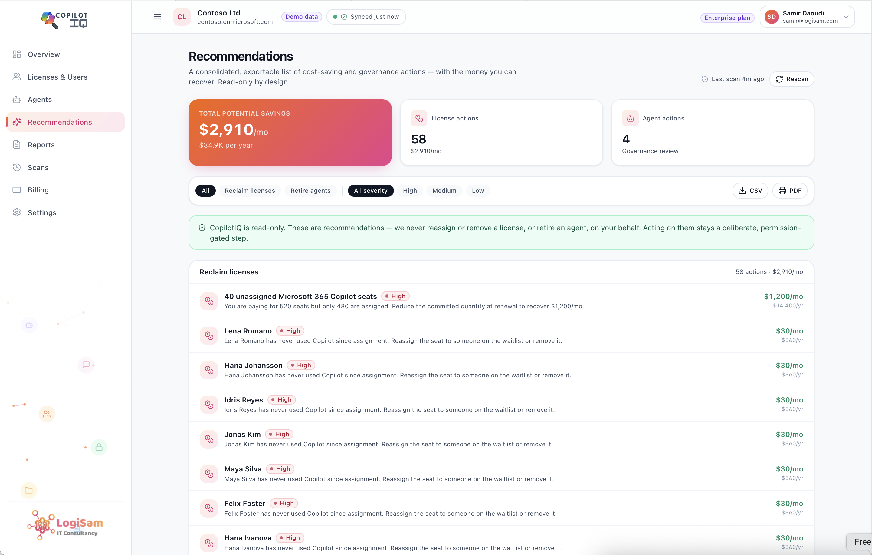
For IT, the report that’s actually actionable is the operational list: specific licence reclamation candidates by name, and specific agents flagged for review, not an abstract percentage but a list someone can work through directly.
Why Format and Export Matter as Much as the Data Itself
A report that only lives inside a dashboard doesn’t make it into a board pack or a renewal negotiation. Every one of these reports needs to export cleanly to CSV or PDF, so it drops straight into whatever format the conversation actually happens in, a board deck, a finance review, a vendor renewal call, without anyone having to manually rebuild it from a live dashboard screenshot.
Equally important is trend visibility. A single snapshot answers “where do we stand today.” A tracked trend over multiple scans answers the more useful question: is spend going up or down, is reclaimable spend actually being recovered quarter over quarter, or is the same waste sitting there unaddressed since the last review. Renewal conversations run on trend data far more convincingly than a single point-in-time number.
What This Looks Like at Renewal Time
When renewal season arrives, the difference this makes is direct. Instead of walking in with an estimate or a general sense that Copilot “seems to be working,” the conversation runs on defensible numbers: here’s what we’re currently paying, here’s the adoption rate broken out by team, here’s the spend we’ve already reclaimed since the last review, and here’s what remains reclaimable this cycle.
That’s the actual difference between hoping Copilot is worth the spend and being able to prove it with a report finance can act on directly, not a dashboard they have to interpret.
How Copilot Insights Generates These Reports
This is exactly what Copilot Insights is built to produce. Every scan generates board-ready reports for each audience automatically, the CIO and CFO summary, the CTO security posture view, and the IT operational list, all from the same underlying tenant data, all exportable to CSV or PDF, and all comparable over time since every scan is snapshotted rather than overwritten.
The result is a renewal conversation that starts from numbers instead of assumptions, and a board update that doesn’t need a follow-up meeting to explain what the dashboard actually meant.
Generate your first executive Copilot ROI report with a free Copilot Insights scan.